


9 min read I Spent 30 Days Analyzing The Best Call To Action Buttons I Could Find On The Internet
Get smarter at creating CTAs people (actually) want to click on.
Call-to-action buttons kill and skyrocket digital startups.
Think about it.
The crazy truth: Every client has to click on the right one to become a client.
But I’ve heard way too many contrasting tips from way too many gurus.
- Some say go soft sale.
- Some say go hard sale.
Instead of taking anyone's word for it, I decided to go on my own micro button hunt mission.
The rules were simple.
Whenever I caught myself wanting to pull a naughty Netflix session I’d have a naughty little peek at the call-to-action buttons of my favorite brands instead.
Here’s what I stumbled upon.
Make it risk-free
People don’t like commitments.
Commitments feel risky.
Nobody wants to sign their soul away.
- Let them try things first.
- Free takes away a lot of stress.
- Let them commit to a baby step.
- Remove the friction along the way.
But let’s see how the best brands pull it off.
Let them try it
People don’t like to commit before they’ve tried.
Airbnb is sitting with a big problem.
It has a lot of visitors, but not always enough hosts.
Being a host is a huge commitment.
Hosts essentially put:
- Their beloved houses on the line.
- Their beloved furniture on the line.
All for a stranger with possibly stinky feet to enjoy.
But instead of using Become a host as a CTA, Airbnb takes away the commitment by instead using Try hosting.
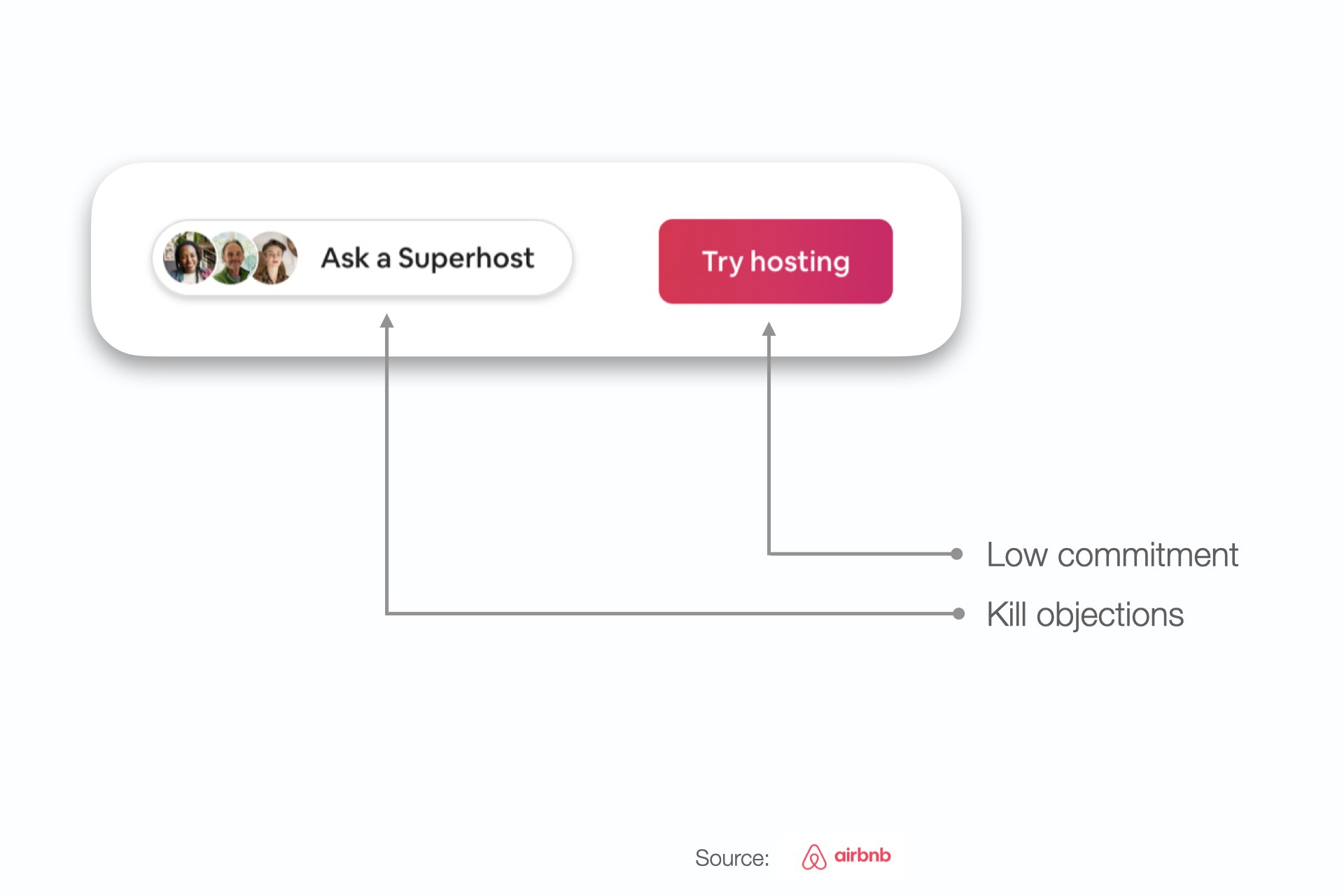
I love how Airbnb allows future hosts to connect to Superhosts — the ultimate objection killer.
Make it free
People like free things.
If we don’t have to pay for something — it feels risk-free.
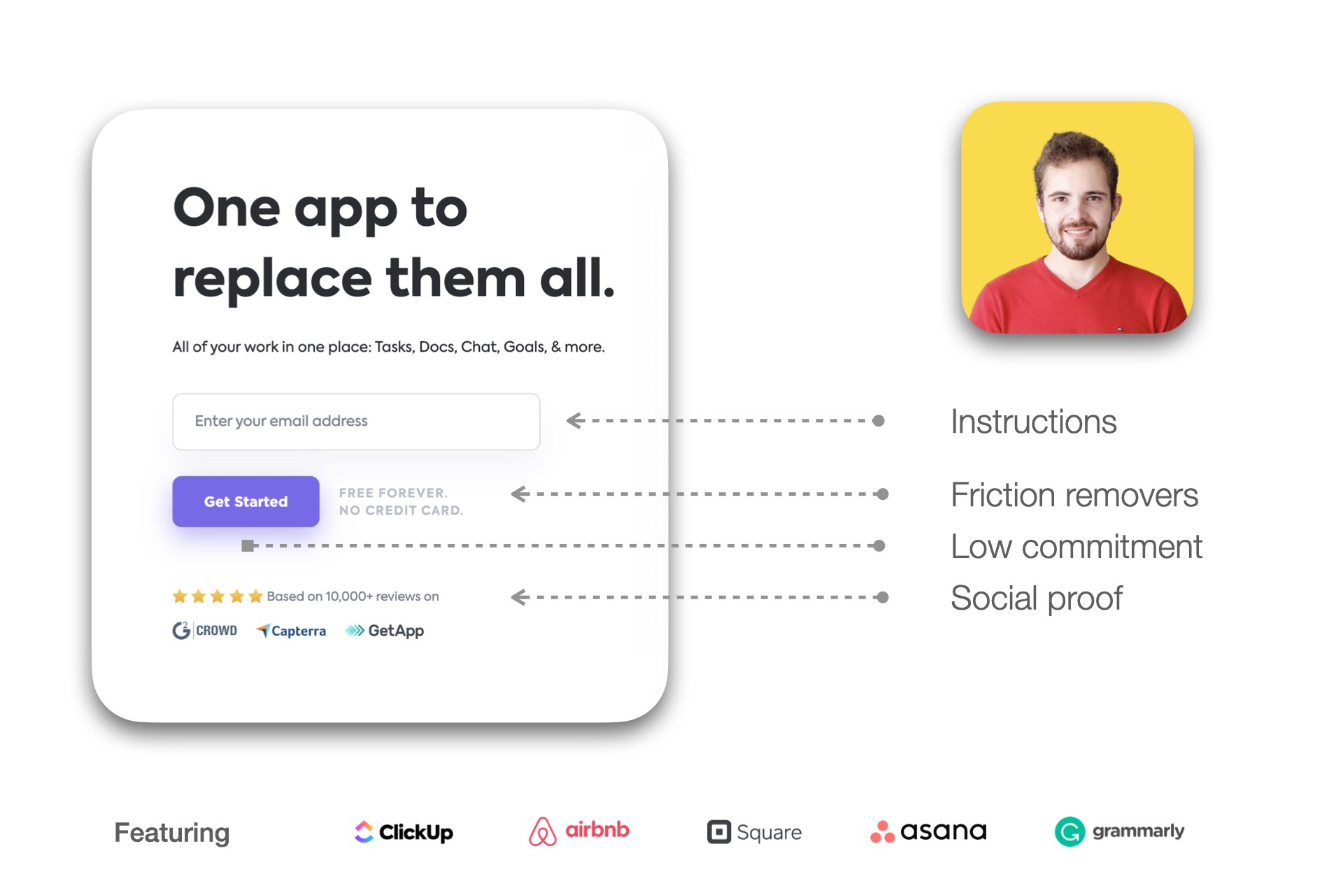
Grammarly is one of the tools I love with a kickass free tier.
Instead of asking a user to sign up and pay immediately like older SaaS companies would have probably done — Grammarly builds trust first and then goes for the sale.
Grammarly’s primary call to action button is strong.
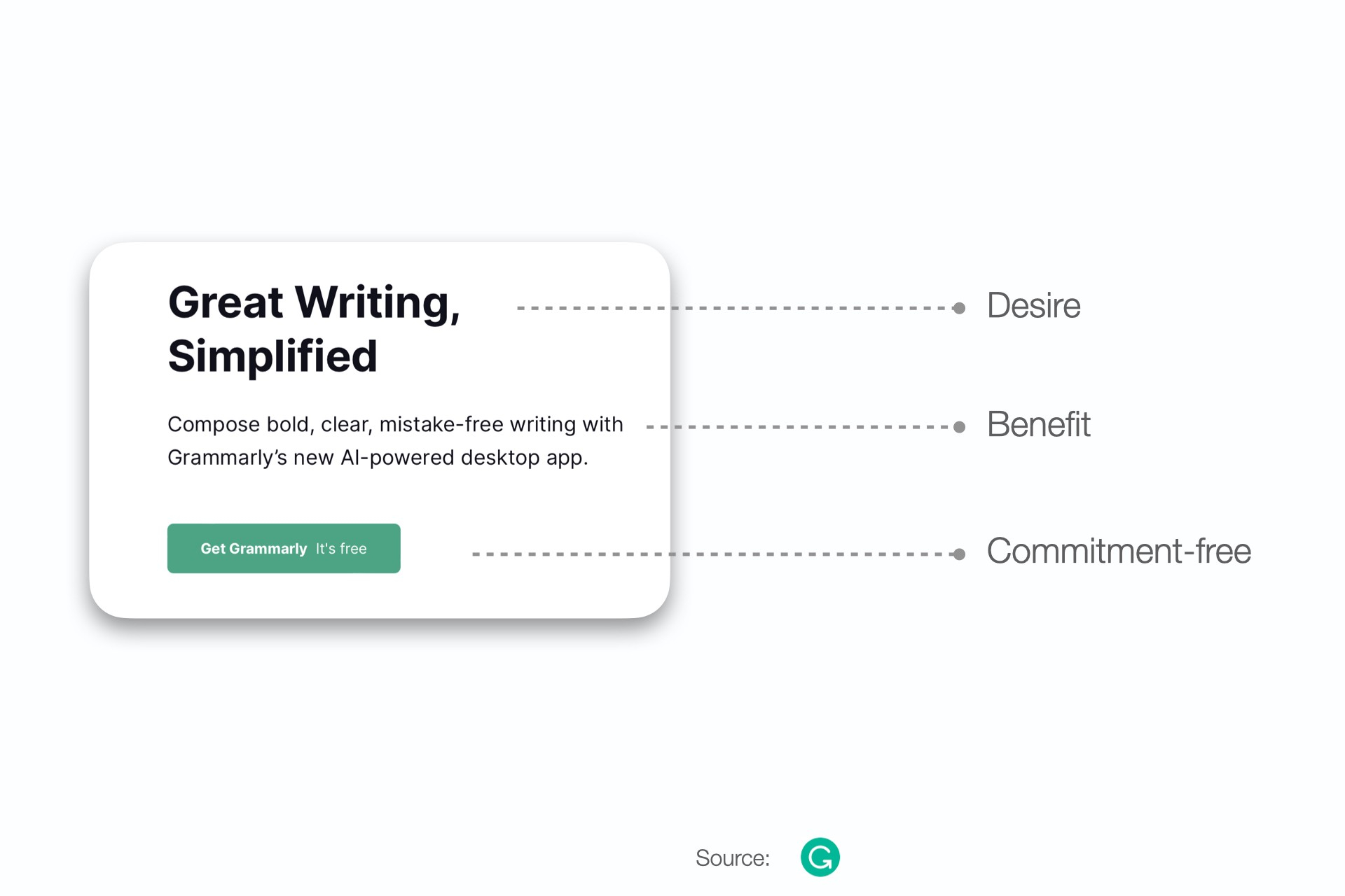
- It shows you, you’re about to get something.
- And then it takes away the friction by telling you it’s free.
The microcopy is also all about making you better which further drives click worthiness.
Make it a baby step
People prefer tiny steps.
Big steps lead to big risks.
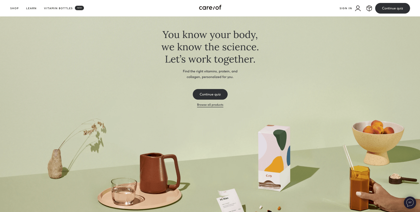
Care/of is one of the most effortless e-commerce stores I’ve seen.
It’s just a reminder of how seamlessly quizzes can be integrated into our marketing funnels — instead of the boring old email sign-up just to blast people with emails.
Add friction removers
Friction removers are typically below a call to action button.
They make it easier to click on the CTA by reducing risks.
I particularly love how Typeform pulls it off here:
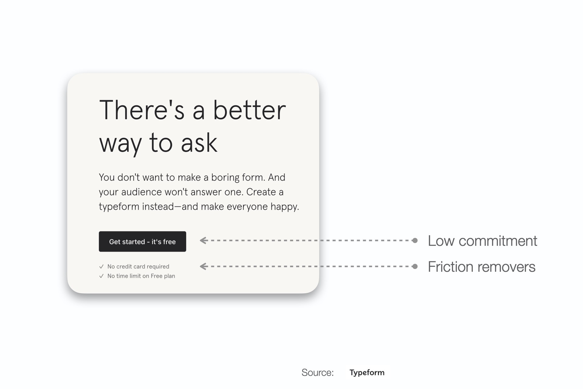
It just feels so clean and effortless. I love it.
Make it a benefit
People like receiving things.
- Gifts
- Value
- Knowledge
But most people don’t like giving away things.
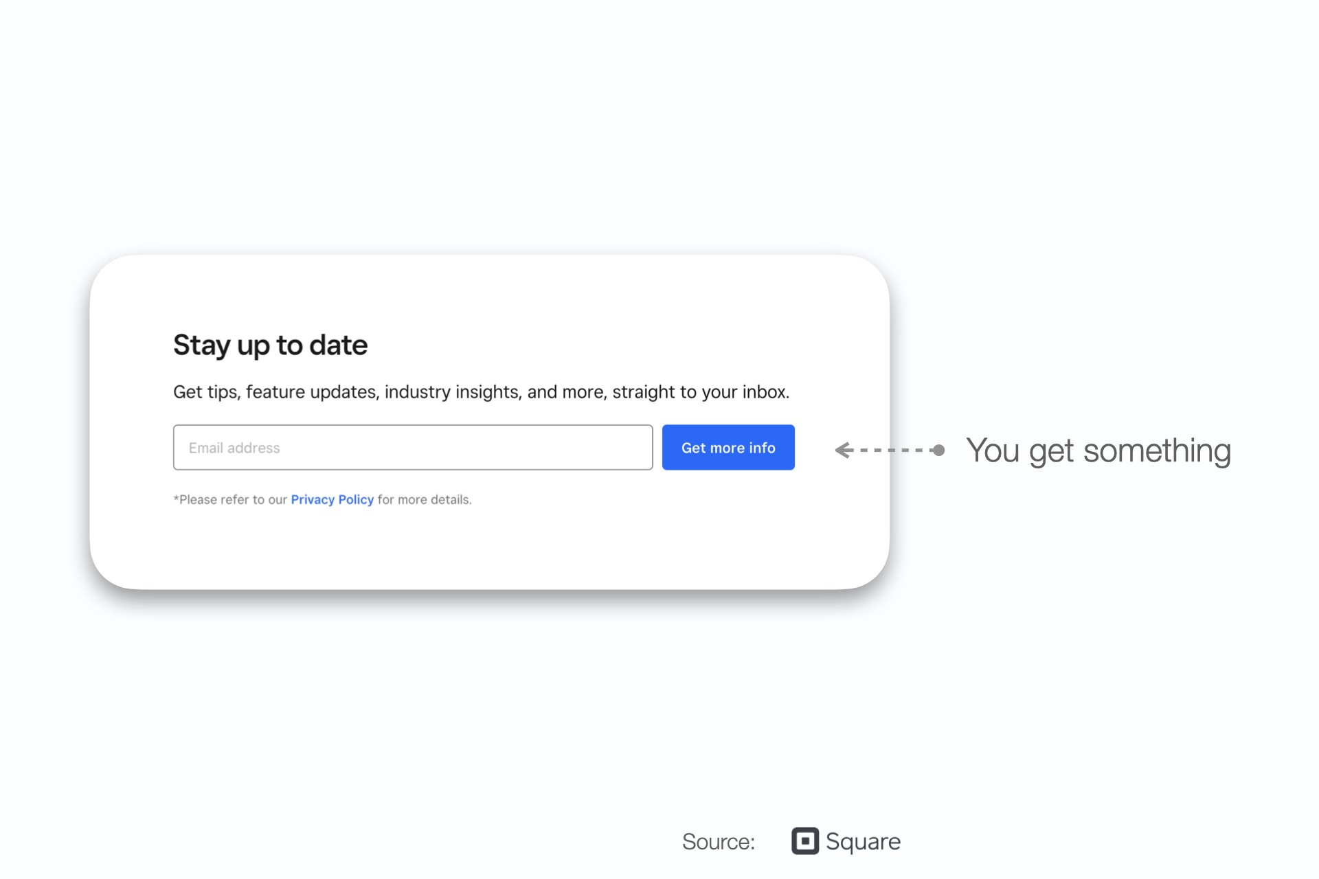
Instead of saying Sign up for our newsletter Square turns it into a benefit by making it Get more info. Again, few want to sign up, many want to receive.
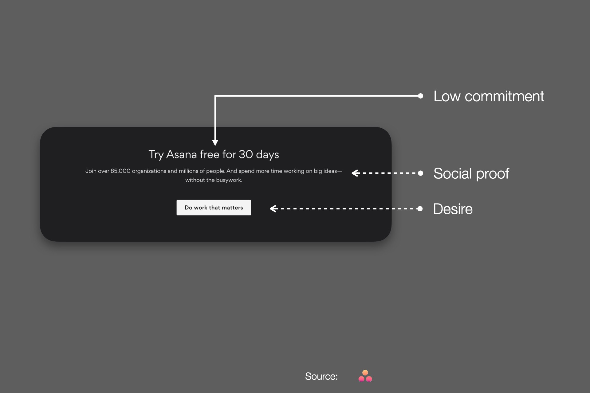
Make it a desire
People like to grow in life.
But the best marketers use these future states as a gateway to tap into by positioning their CTAs as a way to get you there by filling the gap.
I love how Asana uses its mission to get you to move forward.
MailChimp knocks this one out of the park by focusing on helping you improve.
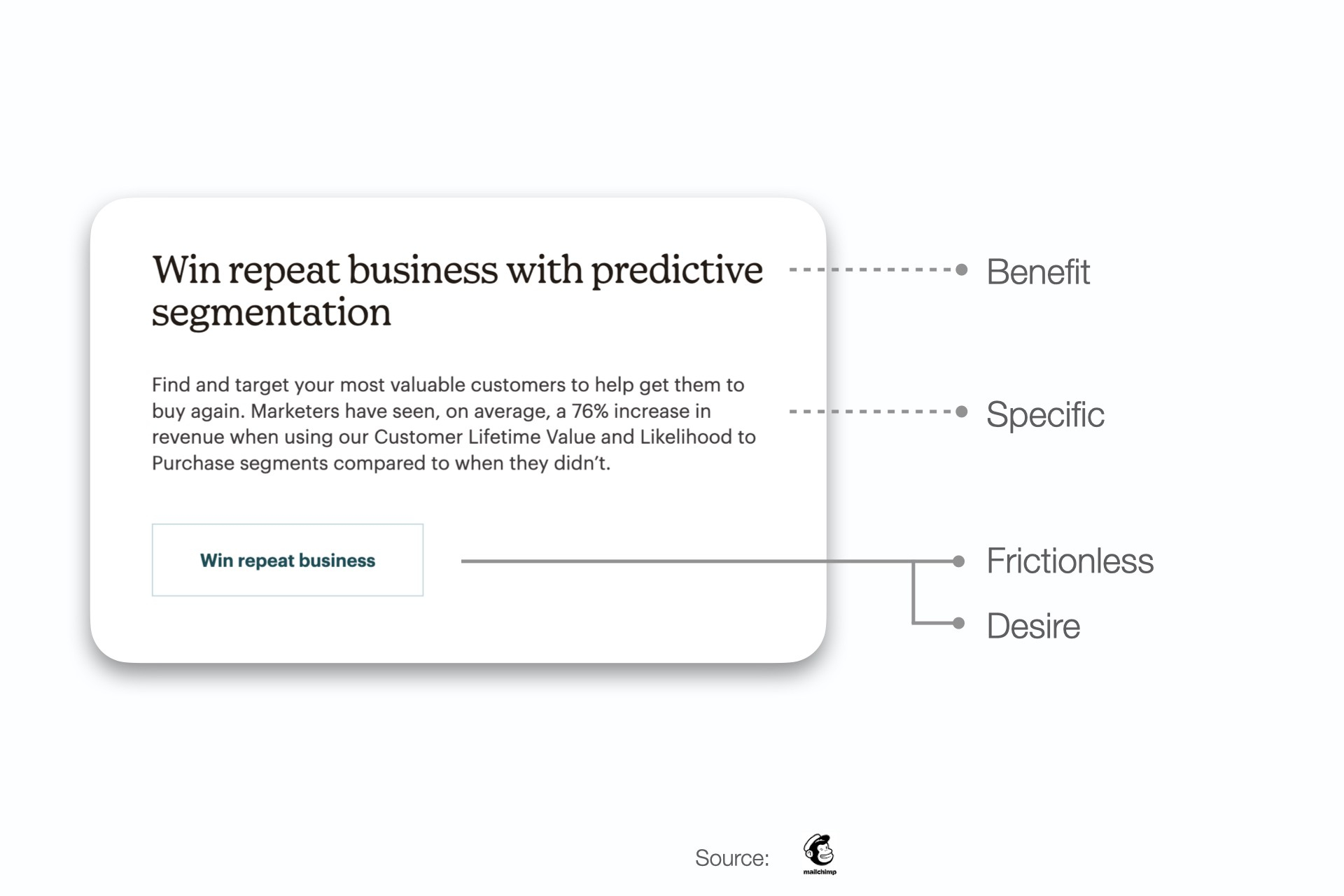
Make it highly specific
People want to know exactly what they are getting themselves into.
Help them find exactly what they want by using meat dress clear CTAs. This can easily reduce the number of steps required to take the desired action by taking away the back and forth.
Take a look at how Airbnb pulls it off:
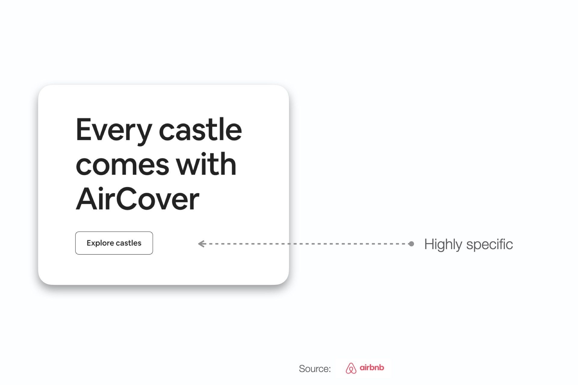
Brilliant!
Sign me up for that castle.
These types of CTAs are also very accessible and SEO-friendly.
Make it exclusive instead of urgent
People like to feel special.
People don’t like to be pushed into a corner.
Exclusivity is a subtle way to drive urgency.
Instead of pushing urgency through tacky words, Linktree uses exclusivity to drive signups.
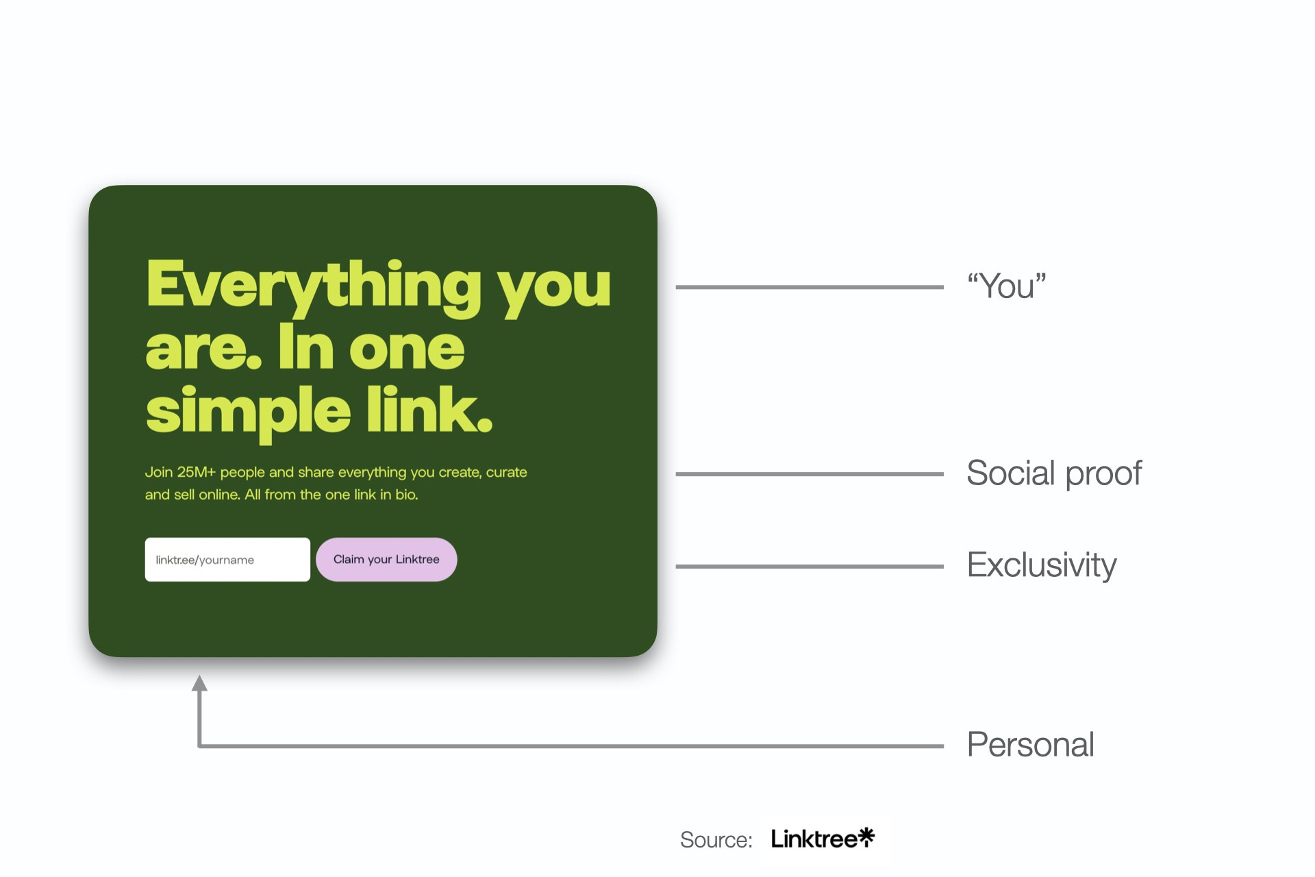
If you don’t claim your special link with your name, someone else might!
Make it clear that others love it
People like things that other people like.
We want to feel like we’re part of a group and doing what others are doing. It makes us feel included.
Our primal brains depended on the tribe for survival.
But social proof can also help increase the perceived value of a product or service.
We are more likely to trust something that has been recommended or reviewed by others.
ClickUp does an excellent job at leveraging reviews right below its CTA to increase signups.
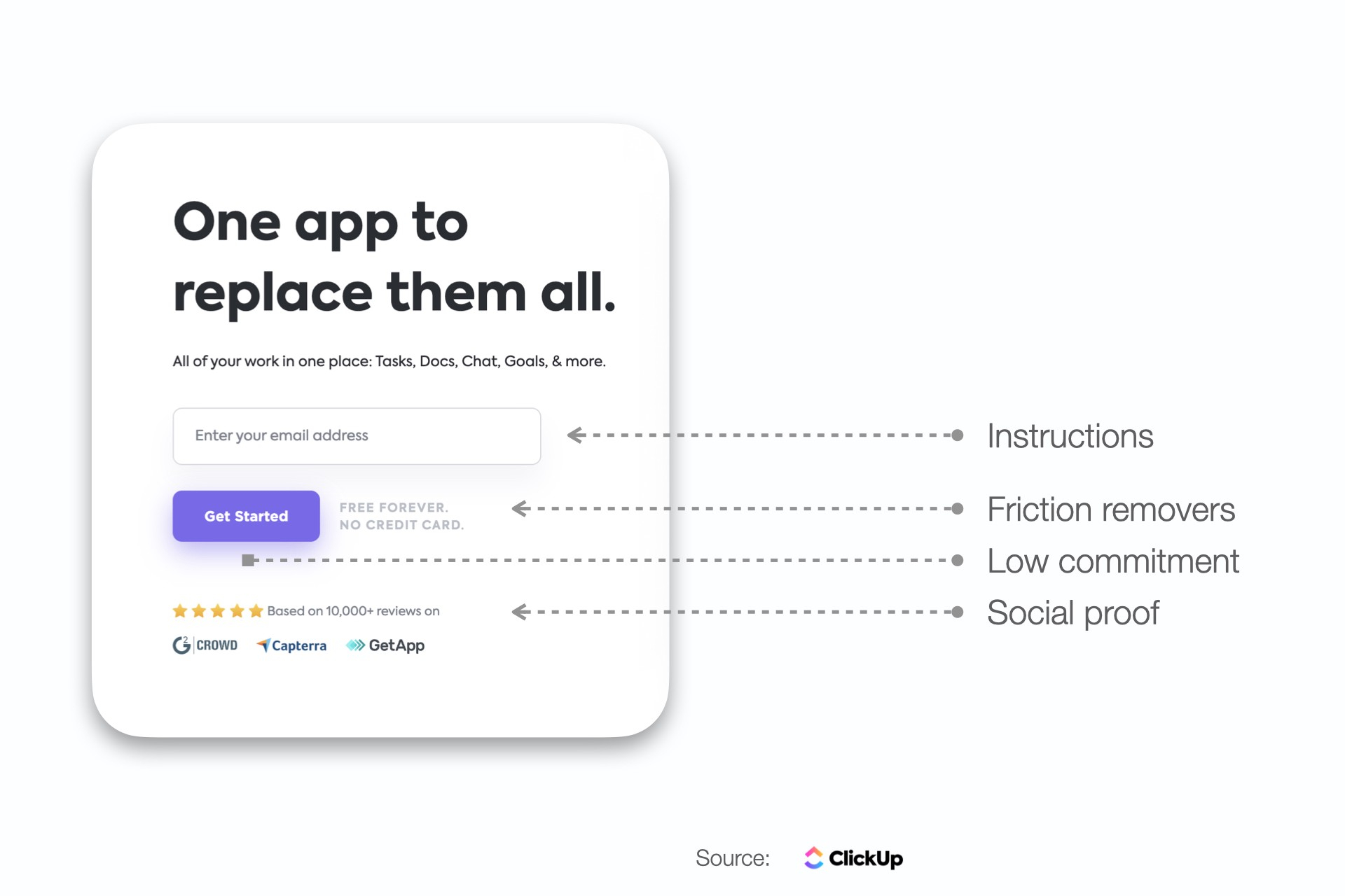
What a frictionless CTA.
No wonder ClickUp is growing so fast lately.
It turns out that removing friction is the way to go with a call to action.
What do most of these buttons seem to have in common?
- They are not pushy.
- They are contrasty and stand out.
- They give you a good reason to click.
- They focus on making lives easier and better.
The best CTA buttons don’t feel like marketing.