


4 min read The unobtrusive psychology of e-com sites

You are more inclined to buy when you imagine the result
For example, when you imagine unpacking a box of goods or understanding the stages that your order goes through before you pick it up, or when you see your avatar in the checkout as some sort of pumped-up computer game character.
Let's show these three points in pictures.
1.Show unpacking
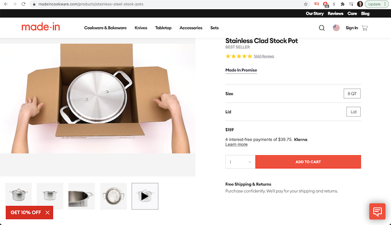
In order to make that decision - to buy or not to buy - you have to imagine yourself buying the pot.
Why? Because you have to gauge your emotional reaction. If the potential purchase is pleasant, I will know exactly what I want to buy. That's how we evaluate decisions.
So why show the unpacking? Unpacking can make these simulations easier.
You are immersed in the person opening the box-you think YOU are opening it.
Suddenly you can imagine buying it, and you interpret it to yourself as, "Hmm, do I want to buy the pot? I imagine buying it. Therefore, I must want to buy it.”
In addition, opening the box is akin to unpacking a gift. Therefore, unpacking activates (1) a mental picture of the purchase and (2) positive emotions.
2.Simplify the movement
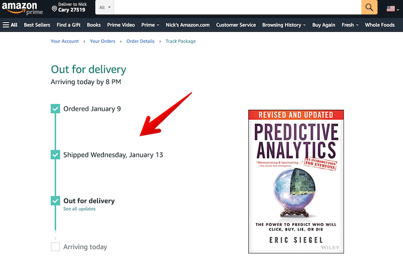
Amazon depicts delivery progress with downward movement.
But why? Most Web sites use horizontal motion. If you read from left to right, you are conceptualizing time moving from left to right.
Why does Amazon exhibit downward motion?
The downward movement seems to be stronger because of gravity.
This movement seems stronger because of gravity. You can imagine that the progress bar moves more easily to later steps (e.g., shipping). Thus, you imagine getting your package faster.
3.Add a user photo

Some Web sites dynamically insert the user (e.g., his picture from Google).
Before marketers take this idea to the point of absurdity - which, let's be honest, they will - here is an example that unites this idea with all the previous ones.
Consider the progress bar...

The user's photo is graphically embedded in the progress bar. Why is this useful?
When you watch the unboxing video, you are immersed in the person opening the box. It feels like YOU are opening the box.
In the picture above, you are immersed in the avatar. You imagine that following the steps is easier - especially because the avatar is YOU.
Plus these hidden signals…
- Color Gradient - The progress bar changes color from left to right, facilitating horizontal movement.
- Short distance - the progress bar is very close to the final step. It seems to you that reaching the final step is easy.
- Photo above the steps - The avatar is above the caption because this position reinforces users' perceived dominance and power, facilitating their ability to overcome distance.
- Horizontality - Even though Amazon shows a descending progress bar, the choice of a horizontal bar is justified because the execution indicator will be shown BEFORE the transaction occurs. In this sense, we strive for clarity by choosing a direction that is semantically consistent with time.